
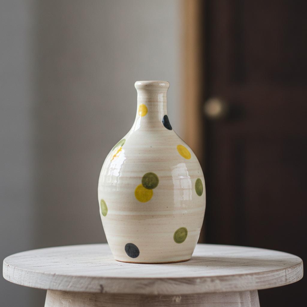
Why a bottle-shaped decorative vessel still matters in modern product sourcing
At first glance, a decorative bottle may seem like a small, almost quiet object. But for product teams, gift buyers, and home-décor sellers, that narrow-neck silhouette can pull a surprising amount of weight. A well-made bottle form sits somewhere between sculpture and utility: it can read as a vase, a shelf accent, a collectible craft piece, or a seasonal gift item depending on finish and proportion. In other words, the bottle shape is doing more than holding flowers. It is carrying visual identity.
That is why buyers still compare bottle options with unusual care. They look at body profile, glaze quality, decoration method, and whether the piece feels calm or too busy in a room. If the item is meant for a tabletop collection, a mantel display, or a small floral arrangement, the decision is rarely only about size. It is also about how the surface speaks. A bottle with a narrow neck and rounded body can look restrained and refined, while a wider opening or heavier base changes the whole mood. For many buyers, that subtle shift is the difference between “nice object” and “works in the line.”
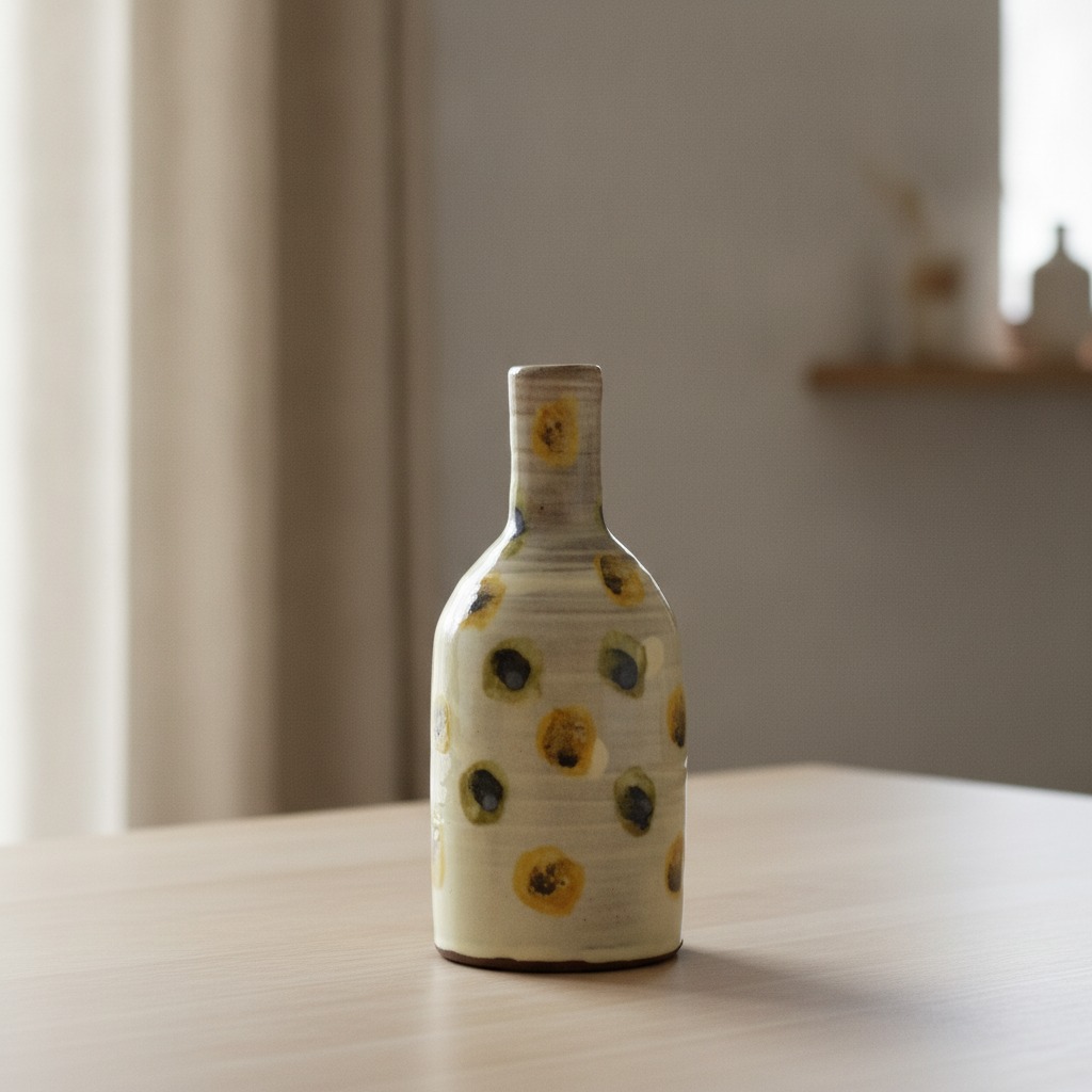
What this type of ceramic bottle is, and what it is not
The product described here is a decorative ceramic bottle or vase with a compact bottle-like form, a cylindrical neck, a tapered shoulder, and a rounded body. The surface appears glazed in a light cream or gray tone, with a horizontal banded or spiral texture and scattered raised circular dot motifs in yellow with darker centers. It has the look of a kiln-fired ceramic piece, likely stoneware or earthenware, though the exact clay body is not confirmed. That caution matters. In sourcing, a piece can look “simple” and still involve a fairly specific body, glaze, and decoration sequence.
What should not be assumed is just as important: exact dimensions are unknown, watertight performance is unverified, and it should not automatically be treated as a functional vase unless that is confirmed. Buyers sometimes get caught here. A vessel that appears vase-like may be intended purely as décor. For shelf styling, that may not matter. For fresh flowers and water exposure, it matters a great deal.
Quick buyer takeaway: where bottle forms win
If you need a fast reference, the bottle shape is most useful when the product brief asks for one or more of the following: a calm tabletop accent, a giftable handcrafted look, a neutral base color with small pops of color, or a form that can stand alone without needing a large floral arrangement. It also works well when the buyer wants something more structured than a bowl and less formal than a tall vase.
The narrow opening gives the object a composed profile. That can be a strength in merchandising, because it lets the surface treatment do the talking. On a crowded shelf, a bottle with a distinctive glaze and controlled decoration often reads better than a larger, more open vessel that loses its silhouette from a distance.
Reading the design: why the surface details change the commercial value
In ceramic décor, the decoration is rarely just decoration. The cream or gray glaze sets the base mood, but the raised circular dots with yellow and dark centers add rhythm. They break the surface into small points of attention. The banded or spiral texture also matters because it gives the hand something to notice. That tactile quality can make the product feel more artisanal, even if it is made in a repeatable production process. Buyers often describe this loosely as “crafted,” but what they are responding to is a combination of relief, gloss, and visual restraint.
The narrow neck and flat base also support the bottle’s character. A narrow neck helps the form feel elegant and compact; a flat base keeps it visually grounded. In a home setting, that balance can be useful on shelves, side tables, and mantels where unstable or top-heavy objects are a concern. It is a small practical point, but retailers know it affects how often an item gets returned or moved around by customers after delivery.
Glaze and finish: the details buyers should inspect first
A glossy ceramic finish can elevate a simple form, but it also reveals flaws more easily. Uneven glaze pooling, pinholes, or overly heavy application may be visible under retail lighting. For a product like this, consistency across the neck, shoulder, and body is worth checking closely. The base color should feel intentional, not washed out. The accent dots should look placed rather than accidental. If the surface pattern is meant to evoke handwork, the line between “organic” and “messy” is thinner than many sourcing teams expect.
How decorative bottle pieces are commonly used in the market
This kind of ceramic bottle sits in a useful middle ground across several categories. It can be sold as home décor, giftware, small-batch craft pottery, or a floral accessory for dried stems. That flexibility is part of the appeal. A buyer does not need it to solve only one problem.
For retail merchandising, these pieces often work in pairs or small groupings, especially when the color palette is restrained. A cream-gray bottle with yellow accents can anchor a vignette without overpowering it. For e-commerce, the shape also photographs well because the neck, shoulder, and rounded body create clear highlights and shadows. The form has depth even before the customer reads the product description.
There is, however, a practical caution worth saying plainly: if the item is meant for flowers, dried stems, or water contact, ask for confirmation on functional use rather than relying on appearance. Decorative bottle shapes often blur the line between vessel and vase, and that ambiguity can become a customer complaint if expectations are not set clearly.
Selection criteria for sourcing teams
When comparing bottle-style ceramic décor, the best evaluation usually starts with three questions: Does the form fit the intended room style? Is the surface decoration consistent? And is the product being sold as decorative only, or as a vessel with a real function? Those questions sound basic, but they prevent the most common mismatches.
For style fit, think about the environment. A neutral cream or gray bottle with soft yellow detail suits calm interiors, natural wood displays, and mixed-material settings. It is less suited to glossy, high-contrast modern spaces unless it is being used as a deliberate accent. For decoration consistency, inspect how the banding, dot placement, and glaze transitions behave from piece to piece. If the dots are part of the identity, irregularity can either add charm or weaken the line, depending on the collection’s positioning.
For function, buyers should separate “looks like a vase” from “should be used as a vase.” That distinction saves time later. If the product is purely decorative, say so early in the spec sheet and listing copy. If it may handle stems, say that only after testing and confirmation. In manufacturing and sourcing, vague claims are often more expensive than cautious ones.
Common mistakes when buying bottle-shaped décor
One frequent mistake is overemphasizing size and ignoring proportion. A compact bottle can look elegant in a photo and awkward on a console if the neck feels too long or the body too squat. Another is treating surface texture as a minor detail. With a piece like this, the banding and raised dots are not side notes; they are the main visual language.
Buyers also sometimes assume that a glazed ceramic bottle is automatically suitable for water. That is not a safe assumption. Without confirmed watertight performance, it is better to market it as a decorative object or use it with dry florals only. A final mistake is mismatching the product’s handcrafted look with overly rigid packaging or branding. If the bottle feels artisanal but ships in packaging that screams commodity, the presentation loses some of its value.
Material and process clues that matter in product development
The visible finish suggests fired ceramic with glaze, likely in the earthenware or stoneware family, though the exact material is not confirmed. From a product-development perspective, that means the buyer should pay attention to surface uniformity, weight perception, and the edge quality around the neck and base. A hand-formed or wheel-thrown appearance can be a selling point, but it also creates variation. That variation is not a defect by default. It becomes a defect when it exceeds the brand’s tolerance for natural differences.
If the piece is decorated after forming, the applied motifs need to survive handling and packaging without rubbing off or chipping. This is especially relevant for raised dots and textured bands. The more tactile the finish, the more the item needs to be assessed as both a visual object and a shipping object. A beautiful bottle that arrives with surface abrasion is not a successful product, no matter how good it looked in the studio.
Practical advice for sourcing and merchandising
For sourcing managers, ask for clear photos of the front, back, side, neck opening, and base. Ask for confirmation on whether the bottle is intended for decorative use only or for floral display. If the product is being positioned as giftware, request packaging details early, because fragile ceramic pieces often fail at the last mile rather than at the factory floor.
For product teams, think about the story this object tells. It is not a mass of function. It is a small object with a composed shape, a muted palette, and a handmade feel. That makes it suitable for seasonal drops, boutique assortments, and curated home collections. It may also work well as part of a paired set with another bottle or a complementary vessel in a related silhouette.
FAQ
Is a decorative bottle the same as a vase?
Not necessarily. A bottle-like ceramic object may be decorative only, even if it can visually function as a vase. Confirm intended use before marketing it that way.
Can this type of bottle be used with water?
Do not assume so. Watertight performance has not been confirmed here, so it should be treated cautiously unless tested and specified.
Why do buyers like narrow-neck bottles?
They create a neat silhouette, support small floral arrangements, and often look more composed on shelves than wider vessels.
What makes this particular style appealing?
The appeal lies in the contrast between the soft neutral glaze and the small yellow-and-dark dot accents. It feels crafted without becoming overly ornate.
A sensible next step for buyers
If you are evaluating a bottle-shaped ceramic decorative piece like this, start with the basics that affect sell-through: form, finish, use case, and packaging. Then decide whether the product should be positioned as shelf décor, a gift item, or a vase-like vessel for dried stems. That decision should come before final copy, not after. It is the difference between a listing that feels clear and one that invites returns.
For the best result, ask for function confirmation, surface-close photos, and any available production details before moving forward. A well-made bottle does not need a long explanation, but it does need the right one.