
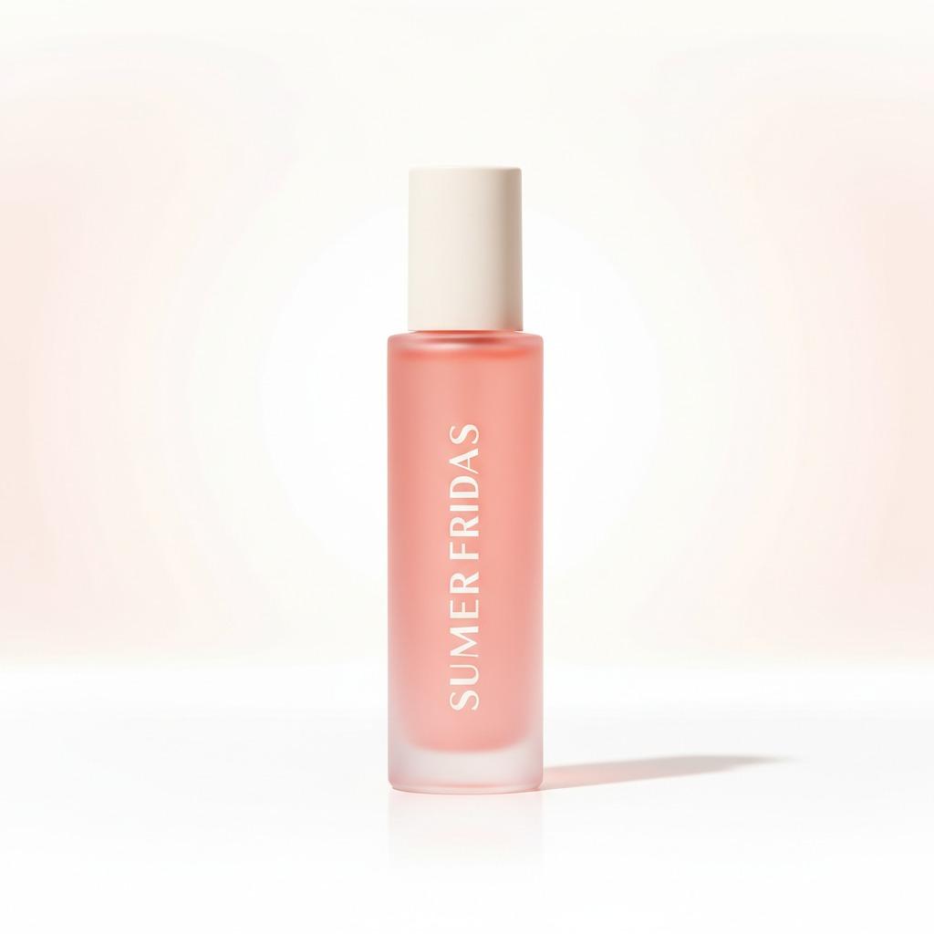
Why lip oil packaging matters more than it first appears
When buyers search for lip oil, they are not only judging shine or texture. They are also judging the bottle in their hand, the way the cap closes, how the product looks on a shelf, and whether the package feels premium enough to support the brand story. In beauty, packaging does a lot of quiet work. It protects the formula, shapes first impressions, and often decides whether a product looks like a sample, a travel item, or a serious retail SKU.
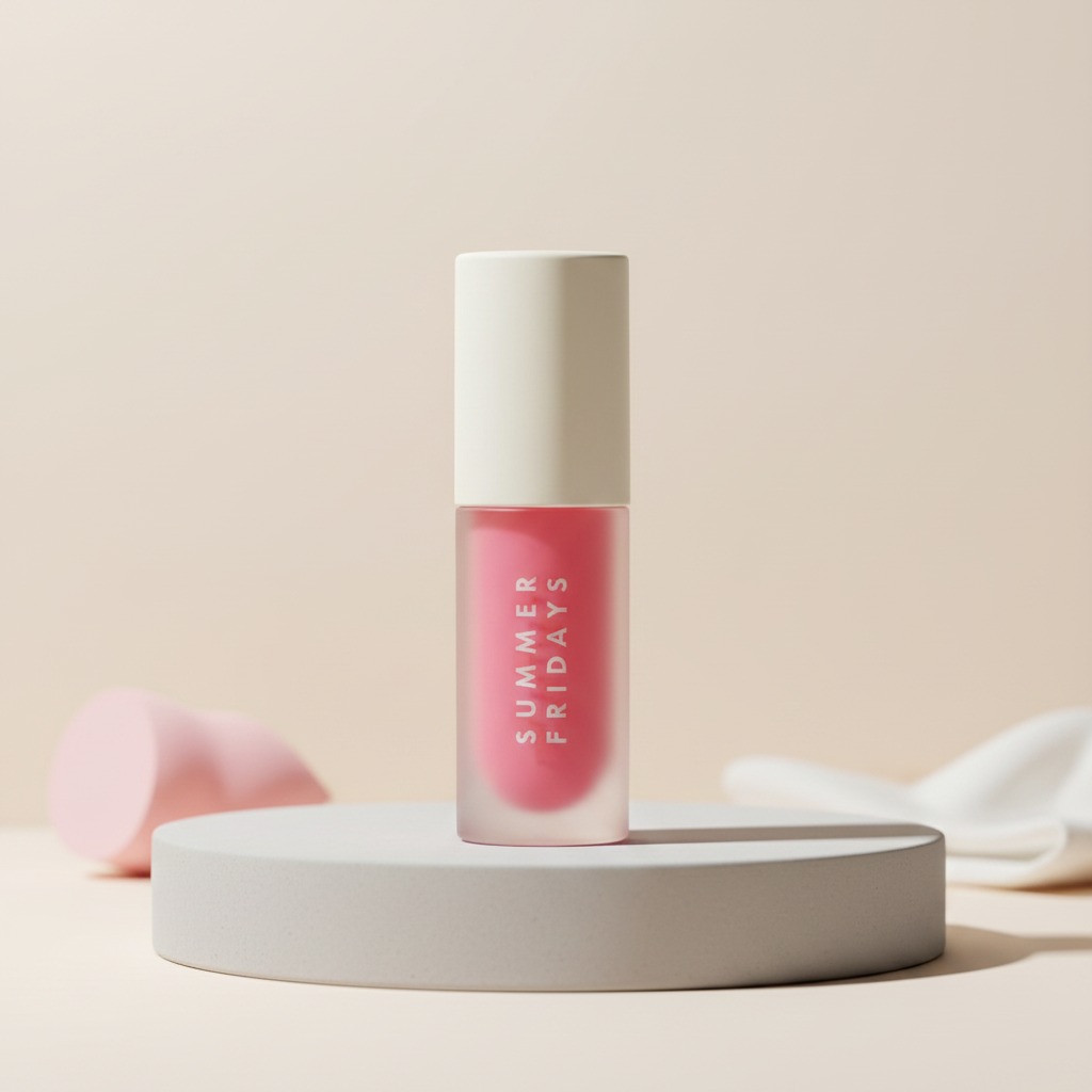
The small cylindrical format shown here is a useful example. It has the tidy, upright profile that beauty brands like for display, with a slim body, rounded shoulders, and a cream-colored cap that softens the overall look. The transparent or frosted lower section reveals a pink-red fill, which gives the package immediate visual appeal. That matters. On a crowded e-commerce page or a glossy counter display, color visible through the container can do more selling than a paragraph of copy.
For sourcing teams, the real question is not just “Does it look good?” but “Does this package support the product, the logistics, and the brand position?” That is the decision this article helps you make.
Quick takeaways for sourcing and product teams
If you are evaluating lip oil packaging or planning a new launch, a few practical points stand out right away.
The cylindrical shape is compact and easy to merchandise. The vertical printed branding gives the package a clean, modern face. The translucent body creates a color cue that can help the product stand out, especially in digital retail where customers scan quickly. The cap appears matte or satin-finish, which usually reads as more restrained and cosmetic than high-gloss plastic.
At the same time, the image does not tell us the exact material, closure style, fill method, or capacity. That is not a small detail. A body that looks like glass may actually be plastic, and a cap that seems simple may conceal a more demanding liner or threaded closure. Buyers should confirm those points early, because they affect drop testing, compatibility, decoration choices, and freight risk.
What this packaging style is good at
Not every lip oil package needs to shout. Some need to look controlled, portable, and polished. A slim cylindrical bottle does that well. It fits neatly into a makeup bag, sits upright on a vanity, and tends to photograph cleanly. For brands selling through e-commerce, a narrow silhouette also helps with thumbnail presentation. The product reads as refined rather than bulky.
That visual restraint can be useful across several beauty categories. A package like this can support a lip oil balm, a lip oil gloss, or another topical liquid or gel product where the formula color is part of the appeal. The visible fill also creates a sense of freshness. Buyers often respond to a package that lets them “see the product” without exposing it completely.
There is, however, a practical caution worth stating plainly: translucent packaging is less forgiving if the formula color shifts over time. If the liquid is prone to settling, discoloration, or separation, the package will show it. That can be a plus or a problem, depending on the formulation discipline behind it.
Reading the design details like a buyer
1. The cap
The opaque cream-colored cap gives the bottle a calm top line. In cosmetic packaging, caps do more than cover an opening; they help set the emotional temperature of the product. A matte or satin cap often signals softness, ease, and a more natural look than chrome or high-gloss finishes. It may also hide handling marks better than shinier surfaces, which matters in retail and fulfillment.
2. The body
The body appears clear or frosted, with enough translucency to show the pink-red fill inside. That is a strong merchandising feature. For lip oil, product visibility can suggest freshness and build confidence. Buyers should still ask the supplier how the body is made, because the answer affects appearance and durability. A frosted plastic shell and a glass vial can look similar in photographs but behave very differently in shipping and during filling.
3. The brand mark
The vertical “SUMMER FRIDAYS” print is a reminder that decoration is not decorative only. It is part of the packaging architecture. Vertical text can elongate the profile and create a more elegant read on shelf. It can also improve recognition if the brand already has strong identity. For a private label or contract manufacturing project, decoration method, print durability, and alignment are worth checking before approval.
How to think about lip oil packaging choices
When brands compare packaging options for lip oil, they usually weigh presentation against practical performance. That balance is rarely perfect, so the decision depends on where the product will be sold and how it will be used.
If the item is intended for retail beauty shelving, the package should hold up visually under bright lighting and repeated handling. If it is for e-commerce, it needs to survive shipping and still look intact when the customer opens the carton. If it is for a travel-size set or sample program, compactness and leak resistance become more important than a dramatic silhouette.
For a lip oil balm format, a tighter dispensing system may matter more than a wide-open design. For a lip oil gloss, the package may need to support a richer visual presentation and stronger shelf impact. The right container depends on the product behavior, not just the label on the front.
Common buyer mistakes with cosmetic liquid packaging
One mistake is choosing the container by appearance alone. A bottle can photograph beautifully and still fail in filling or transport. Another mistake is overlooking closure details. The cap may look simple, but if the seal is inconsistent or the thread engagement is weak, the package can become a headache in distribution.
Another issue is decoration overreach. Some brands load too many visual elements onto a small package, which can make it feel crowded and reduce readability. In a slim cylindrical format, the surface area is limited. That means every millimeter matters. Clean branding often works better than trying to say everything at once.
Finally, buyers sometimes underestimate how much product color influences packaging perception. A transparent body can elevate a beautifully tuned formula. It can also expose batch variation more clearly than an opaque container would. If your formulation team expects color drift, test the visual result early.
Questions to ask before you place an order
Even if the product type is still being finalized, procurement teams can narrow the risk by asking the right questions up front.
What is the exact material of the bottle and cap? Is the body glass or plastic, and is the finish fully clear or partially frosted? What closure system is used, and how is leakage prevented during shipping? What decoration method is applied to the brand mark? Is the package intended for filling on an automated line or by hand? Can the supplier support the retail presentation you need for e-commerce photography, shelf display, or sample distribution?
These questions may sound basic, but they are where many packaging projects succeed or stall. A supplier that can answer them cleanly is usually easier to work with than one that leans on vague product images alone.
Practical use cases for this style of bottle
This type of package makes sense for several beauty and personal care uses. It suits retail beauty product packaging where visual identity matters. It also fits travel-size or sample-size programs, especially when brands want something small enough to tuck into a kit but polished enough to stand on its own. In merchandising, slim cylindrical bottles also stack and line up neatly, which helps presentation teams keep displays orderly.
For sourcing managers, the value is straightforward: a format like this can bridge brand aesthetics and operational practicality, as long as the technical details are confirmed before production starts.
FAQ
Is this definitely a lip oil bottle?
Not necessarily. The visible shape and presentation suggest cosmetic or personal care use, but the exact formula is not visible. It could also serve as packaging for another topical liquid or spray-applied product.
Can the same format be used for lip oil balm or lip oil gloss?
Potentially, yes. The category depends on the formula and dispensing needs. The container style may work for either, but the closure, applicator, and viscosity requirements should be matched carefully.
What should I verify with a supplier first?
Confirm material, capacity, closure type, decoration method, filling compatibility, and shipping performance. Those details matter more than the photo when you are moving from concept to production.
A sensible next step for buyers
If you are assessing lip oil packaging for a new launch, start with the visual brief, then move quickly into technical checks. Ask for the exact substrate, closure specification, decoration samples, and packaging compatibility details before you commit to a run. A package like this can be a strong fit for a beauty brand, but only if the mechanics match the formula and the route to market.
Good cosmetic packaging should do three things at once: protect the product, support the brand, and survive the realities of production and shipping. When those three line up, the bottle stops being just a container and becomes part of the product’s value.