
Why Lip Oil Packaging Matters More Than It Looks
A lip oil may be a small cosmetic item, but the packaging does a lot of heavy lifting. It has to protect a delicate formula, present the color clearly, feel good in the hand, and survive the realities of retail shelves, shipping cartons, and vanity drawers. For brands, the package is often the first decision a buyer notices before they ever test the formula. For sourcing teams, it is also where costs, compatibility, and customer experience can quietly go right or wrong.
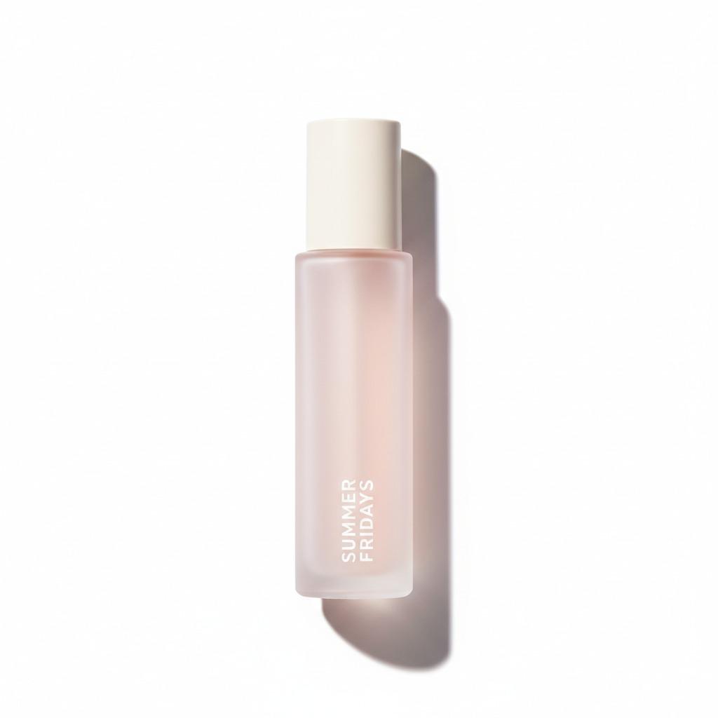
In practice, many lip oil formats sit at the intersection of skincare and color cosmetics. That means the container cannot be chosen casually. A lip oil balm, a lip oil gloss, and a simple oil serum may all look similar from a distance, but their packaging needs can differ quite a bit depending on viscosity, applicator style, branding, and how the product is expected to be used. A compact cylindrical bottle with a translucent body and a matte cap, for example, can support a clean, premium look while still letting shoppers see the shade or fill level at a glance.
This article is for product teams, sourcing managers, and engineers who need a practical way to think about lip oil packaging: what matters, what can be specified early, and what should not be assumed too quickly.
What a Good Lip Oil Package Has to Do
At a basic level, the container has three jobs: hold the formula securely, present it attractively, and make it easy to use. That sounds straightforward until you start comparing formulas. A thinner lip oil may need a different closure or applicator behavior than a thicker, more cushioned lip oil balm. If the formula is glossy and high-slip, residue at the neck or cap can become a customer complaint. If the formula is more pigmented, separation and settling may matter. If the product is positioned as a travel-size or sample item, compactness and leak resistance become more important than elaborate decoration.
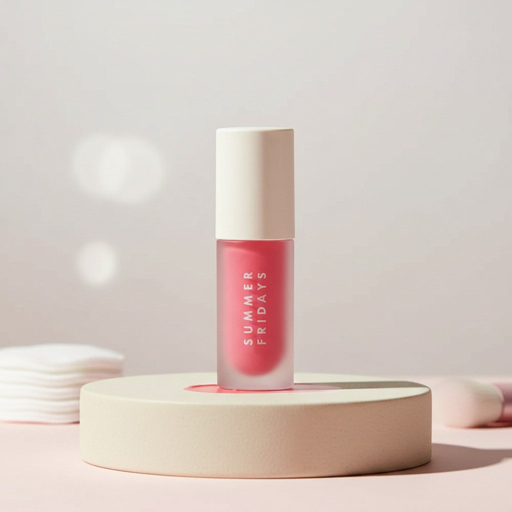
The visible container described here—a straight-sided round cylinder with a flat, opaque cream-colored cap and a translucent body—captures a common modern packaging logic. It is minimal, legible, and easy to brand. The vertical front text gives it a clean shelf read, while the translucent section lets shoppers see the liquid color or remaining volume. That is not a minor detail. In beauty, visual confirmation often increases perceived value, especially for products sold through e-commerce where customers cannot touch the package first.
Quick Comparison: What Buyers Usually Evaluate
Before placing a packaging order for lip oil, most teams end up comparing a few practical factors rather than chasing abstract aesthetics.
1. Material and finish
The body may appear clear or frosted plastic with a matte or semi-matte look. That finish can signal a softer, more premium identity than a fully glossy shell, and it also tends to photograph well. The cap, in contrast, is often chosen for grip, sealing reliability, and visual contrast. In the example described, the cream-colored cap creates a simple two-tone composition that feels calm rather than loud.
2. Closure style
The exact closure is not visible, so it would be a mistake to assume pump, dropper, roller, or screw cap. For buyers, that unknown matters because the closure must match both the formula and the intended user experience. A lip oil gloss that is meant to be applied quickly at a desk may need a different dispensing system than a nourishing overnight lip oil balm.
3. Branding space
Printed front text, like the vertical “SUMMER FRIDAYS” marking shown on the bottle, is a reminder that even small packs need clean label real estate. If the branding is cramped or obscured by the product level, the package can look busy or less premium than intended.
4. Retail and shipping behavior
A small cylindrical pack is usually favorable for countertop display and travel kits. Still, sourcing teams should check whether the shape nests well in cartons, whether the cap resists loosening in transit, and whether the body can withstand pressure or scuffing. These are the kinds of issues that show up late if nobody asks early.
How Lip Oil Packaging Supports the Formula
Packaging is not just a container; it is part of the product system. A lip oil can be sensitive to oxygen exposure, contamination, and temperature swings. Even when the exact formula is unknown, the packaging must be selected with enough discipline to avoid unnecessary risk. A translucent body is useful for merchandising, but it also means the product level and color are visible from day one. That can be a selling point, yet it can also expose slight settling or oil separation if the formula is not stable enough for the package format.
For this reason, product teams often treat packaging and formula as a matched pair. If a brand wants a lip oil gloss with a high-shine, showy look, the package may need to support a more decorative presentation and easier dispensing. If the product leans toward a lip oil balm with a more caring, cushiony feel, buyers may prioritize controlled application and a cap that feels secure in everyday use. The package should reinforce the product promise instead of fighting it.
Design Details That Change the Buying Decision
Some packaging details look cosmetic on the surface but have real sourcing consequences.
The first is the body geometry. A straight-sided round cylinder is simple to mold, easy to grasp, and generally efficient for production. It also reads as tidy on shelves, which matters in beauty aisles that are already crowded with visual noise. Rounded bases can help the item sit more elegantly and may also reduce the sense that it is a cut-off tube or disposable sample vial.
The second is opacity control. A translucent body gives visibility, but the degree of frost or clarity influences how premium the item feels. Too clear, and the package may look generic. Too opaque, and the buyer loses the ability to see the fill level or color cue. This balance becomes especially important for retail beauty product lines and gift sets, where presentation can outweigh pure utility.
The third is printed branding. Vertical text is a neat choice for small cylindrical formats because it makes the front surface feel less crowded. It also works well when the design team wants the logo to read from a slight distance without taking over the entire package.
Common Mistakes When Sourcing Lip Oil Packaging
One common mistake is to treat all lip oil packaging as interchangeable. It is not. Even when two items look similar on a render, the formula can behave differently in real life. A thinner oil may creep into threads or around the neck; a thicker gel may not dispense cleanly. If the packaging is selected before the formula is tested, the final product can feel awkward in use.
Another mistake is underestimating the difference between a sample-size container and a retail SKU. A small bottle can work beautifully for travel-size packaging or a promotional gift set, but that same size may feel underwhelming if the product is positioned as a core item. In beauty, size carries meaning. Customers read value from the package before they read ingredient lists.
A third issue is assuming the same package will work across multiple categories. A package suited to a fragrance sample may not be ideal for lip oil packaging, and a package designed for a body care serum may not handle cosmetic pigment or application habits in the same way. The container has to fit the product behavior, not just the marketing story.
What Buyers Should Ask Before Approving a Lip Oil Container
When evaluating a new lip oil package, buyers usually need answers to a small set of practical questions rather than a stack of glossy renderings.
Is the material glass or plastic, and can that be confirmed by the supplier rather than guessed from appearance? What type of closure is actually used? Does the package support the formula’s viscosity and shelf life? Will the branding survive handling, filling, and shipping without rubbing off? Can the package be displayed cleanly in e-commerce photography and still look good in person? These are the questions that reduce rework later.
For an item with a minimal two-tone design, buyers may also want to ask whether the cap finish is consistent across production lots and whether the body’s translucent effect changes under different fill levels. Small visual shifts can matter more than people expect, especially in beauty where customers notice if a product looks slightly off compared with the approved sample.
Practical Notes on Presentation and Merchandising
Beauty packaging is often judged in motion: on a shelf, in a box, on a vanity, or in a phone photo. A compact cylindrical lip oil bottle has an advantage because it is easy to stage in all those settings. It does not sprawl across the frame, and the vertical label can be read quickly. The translucent body showing a pink liquid or gel also creates a subtle merchandising cue, suggesting freshness and useable volume.
That said, if the product line expands, the brand should avoid relying only on visual consistency. Packaging families need enough variation to distinguish shades, formula types, or tiered offerings. Otherwise, buyers and end users may confuse a lip oil balm with a lip oil gloss, or mistake a travel-size item for a full-size SKU.
FAQ
Is a translucent body always better for lip oil?
Not always. It is useful when seeing the fill level or color is part of the product appeal. If the formula is unstable in appearance or the brand wants a more opaque luxury look, a different body treatment may be better.
Can one package work for lip oil, gloss, and balm?
Sometimes, but not by default. The formula texture, applicator needs, and consumer expectations may differ enough that one package becomes a compromise. It is better to validate the product and package together.
What is the biggest risk in small cosmetic containers?
Usually it is mismatch: the wrong closure, the wrong dispensing behavior, or a package that looks attractive but is not robust enough for shipping and daily use.
Next Step for Sourcing and Product Teams
If you are selecting packaging for a lip oil launch, start with the formula behavior, then define the closure, body material, and visual presentation together. A compact cylindrical container with a matte cap and translucent body can be a strong fit for retail beauty, sample programs, and travel-size presentation, but only if the dispensing system and sealing performance are aligned with the actual product. In other words, let the formula lead the decision, and let the styling support it. That approach saves time, and usually a few headaches too.