
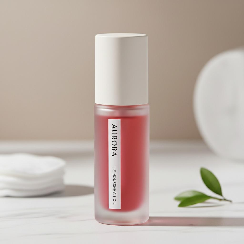
What a lip oil package has to do before anyone even opens it
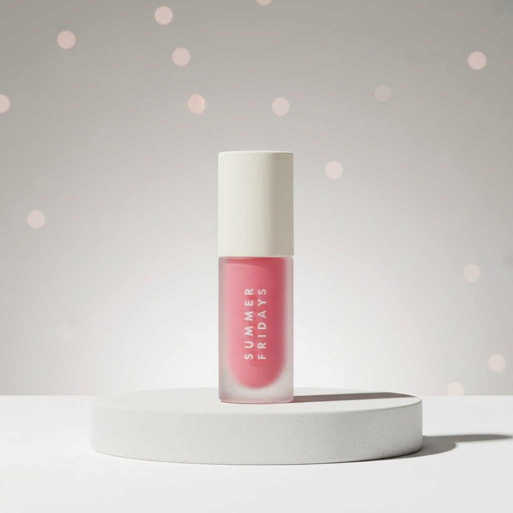
A lip oil is a small product with a lot of jobs. It has to look clean on a vanity, protect a delicate formula, travel well in a bag, and still feel premium enough that the customer wants to pick it up in the first place. In beauty, that is often decided by the package before the formula is ever tested. For brands and sourcing teams comparing lip oil packaging options, the real question is not just what looks attractive on a shelf, but what design will support the product through filling, shipping, retail handling, and daily use.
The example here suggests a compact cosmetic bottle with a straight-sided cylindrical body, an opaque off-white cap, and a frosted or translucent lower section that shows a pink or red fill. That kind of presentation is common in modern personal-care packaging because it does a few things at once: it signals a lightweight, portable format, makes the product visually legible, and keeps the branding restrained. For a product such as lip oil, which is usually sold on texture, shine, and convenience, those details matter more than they first appear.
Why packaging matters so much for lip oil
Lip oil sits in a crowded category. Buyers compare it against gloss, balm, and treatment-style hybrids, often with only a few seconds of attention on shelf or in an online thumbnail. That means the packaging has to communicate a credible balance of care and cosmetic appeal. If the bottle looks flimsy, overly busy, or awkward to use, shoppers can assume the formula itself is equally compromised, even when that is not true.
From a manufacturing point of view, lip oil packaging also has practical demands. The product may be sensitive to leakage, oxidation, or contamination if the closure system is poorly matched to the formula. A bottle that is easy to fill but hard to seal is a production headache. A bottle that looks elegant but topples easily is a retail problem. And a bottle that hides the fill level completely may frustrate users who like to see how much product remains.
That is why buyers often look first at the container format, not just the decoration. A simple cylindrical package, for example, is usually easier to align with automated filling lines and easier to brand with minimal graphics. It also creates a tidy silhouette that reads as contemporary rather than overly decorative.
Quick reference: what to look for in a lip oil container
When a sourcing manager is reviewing lip oil packaging, the short list usually looks like this:
- Compatibility with the formula, especially if the oil has fragrance, pigments, or active ingredients.
- Closure security, so the product can survive transport and everyday handling without leaks.
- Visual clarity, including whether the body should be transparent, frosted, or fully opaque.
- Branding surface, because the package needs enough space for logo placement and regulatory text.
- Consumer usability, including grip, opening force, and the ease of dispensing.
- Production practicality, such as whether the shape can be filled efficiently and packed without special handling.
Those are basic points, but in this category they separate a package that merely looks nice from one that can actually support a commercial launch.
Why the slim cylindrical format works
The bottle described here uses a small cylindrical form with rounded transitions at the shoulder and base. That is not a flashy shape, and that is exactly why it works. Cylinders are visually stable. They stack neatly in trays, photograph well, and give label designers a clean canvas. In personal care, where the product itself is often marketed as effortless and portable, this kind of geometry feels consistent with the message.
The translucent lower body is also a useful detail. It lets the customer see the color or level of fill inside without exposing the entire contents. That is a good compromise for brands that want a soft, premium look instead of a fully clear bottle. A frosted finish can make the package feel more refined and can help disguise minor scuffs that might be visible on high-gloss plastic. It is not a miracle solution, though. If the coating or print quality is poor, frosted surfaces can still look cheap fast.
The opaque cap adds another layer of control to the design. It creates a visual break and makes the top section feel secure. For lip oil, where consumers instinctively care about sealing and cleanliness, that matters. Even without knowing the exact closure mechanism, a cap that looks solid and fits tightly is reassuring.
lip oil คืออะไร, and why buyers search for it that way
Some buyers search for lip oil in English, while others search in Thai using lip oil คือ or ลิปออยล์. That usually means they are looking for a plain explanation first: what the product is, how it is packaged, and how it compares to gloss or balm.
At a practical level, lip oil is often positioned as a cosmetic oil for the lips, usually sold in a small consumer-friendly container. The formula itself may be intended to add shine, comfort, or a conditioning feel. Because the market uses the term in slightly different ways, packaging becomes part of the definition. A package that looks sleek, travel-sized, and clean tends to reinforce the idea that the product is lightweight and easy to use.
For sourcing teams, that means packaging is not just a shell. It is part of the product story.
Common packaging choices and what they imply
Not every lip oil package has to follow the same model. Brands usually choose between a few familiar directions, each with trade-offs.
Transparent or semi-transparent plastic bottles
These make the fill level visible and can help show off the color of the formula. They are often practical for mass-market or retail-friendly products. The downside is that visibility can expose inconsistencies in the fill, air bubbles, or slight discoloration if the formula changes over time.
Frosted finishes
Frosted bodies give a softer, more upscale impression. They also obscure the contents just enough to feel curated. This works well for beauty products that want to look refined without becoming precious or fragile.
Opaque packaging
Opaque bottles are useful when light sensitivity is a concern or when the brand wants stronger visual identity through print and shape alone. The trade-off is that users cannot see the remaining product, which some customers dislike.
Miniature travel-size formats
Travel-size containers are popular for lip oil because the category is often an impulse purchase, a gift-set add-on, or a countertop item. They are easier to carry, easier to merchandize, and usually lower risk for first-time buyers. Still, the small format can be unforgiving: if the closure is awkward or the label is too small, the entire product can feel underdeveloped.
Selection criteria that matter to engineers and product teams
When choosing a lip oil container, the debate should not start with decoration. It should start with process fit.
First, check material compatibility. The product information here suggests a plastic body, but the exact material is not specified. That means a buyer would normally want to confirm compatibility with the actual formula, especially if the oil contains fragrance components, pigments, or other ingredients that can interact with plastics or printing.
Second, think about dispensing behavior. The exact applicator is not visible, so it is not safe to assume whether the package uses a spray pump, rollerball, dropper, or another closure system. That uncertainty is important. The dispensing system has to match the viscosity and intended consumer experience. A lip oil that is too thick for a narrow pump can frustrate users. One that is too runny for a broad applicator can feel messy.
Third, consider shelf presentation and handling. A compact cylinder is efficient, but only if the bottom is stable enough to stand upright and the cap can be handled repeatedly without loosening. Those are small things until they are not. Retail returns often begin with small things.
Branding lessons from a minimal package
The visible “SUMMER FRIDAYS” vertical text suggests a minimalist branding approach. Whether the final product is positioned as premium, clean beauty, or everyday indulgence, minimal labeling can be effective when the container shape is already doing some of the work.
But minimal branding also raises the bar on print quality. A simple package leaves little room to hide uneven text, poor alignment, or weak color contrast. In other words, the cleaner the design, the more precise the decoration has to be. That is a useful reminder for any brand planning cosmetic packaging: sparse does not mean easy.
Common mistakes buyers make
One frequent mistake is assuming a beautiful sample will behave the same way in production. A prototype can sit nicely on a desk and still fail under real filling or shipping conditions.
Another mistake is choosing a package that photographs well but is awkward in hand. Lip oil is touched, opened, capped, and carried. It cannot live only in a render.
A third mistake is underestimating the value of visibility. Some products need a clear or semi-clear body because consumers want to see the shade or the level of remaining product. Others need opacity to protect the formula. The point is to choose intentionally, not by habit.
Practical advice for sourcing and development
If you are evaluating lip oil packaging, ask for samples that reflect the final decoration, not just the raw bottle. Check the cap fit, print durability, and visual balance under normal lighting, not only studio light. If the package will go into gift sets or countertop displays, ask how it sits beside neighboring products. Small cylindrical bottles can look elegant in a row, but they can also vanish if the branding is too faint.
It is also wise to test how the package feels after repeated opening and closing. A closure that feels secure on day one but loosens after use is a consumer complaint waiting to happen. That kind of detail rarely shows up in a product photo.
FAQ
Is lip oil always packaged like a gloss?
Not necessarily. Lip oil may share retail space with gloss, but the package can be quite different depending on formula, brand positioning, and dispensing method.
Why do so many lip oils use small cylindrical bottles?
Because the format is compact, easy to merchandize, and visually tidy. It also suits travel-friendly, premium, or gift-oriented products.
Should the bottle be transparent?
Not always. Semi-transparent or frosted bodies can offer a cleaner look while still showing enough of the fill to be useful.
What should a buyer confirm before ordering?
Material compatibility, closure performance, decoration quality, and whether the package truly matches the formula and the intended consumer use.
What this kind of package says about the market
The appeal of a package like this is that it balances clarity and restraint. It does not shout. It signals a modern beauty product with a compact footprint and enough visual polish to sit comfortably in retail, online, or gift-set settings. For teams developing a lip oil line, that is a useful benchmark. The best packaging does not simply hold the formula; it helps explain the product before the first swipe.
If you are comparing packaging concepts for a lip oil launch, start with the container structure, then move to dispensing, decoration, and brand fit. The sequence matters. A good-looking package that fails in use is expensive. A plain one that works well can still win buyers if it feels deliberate.
For sourcing discussions, the next step is usually simple: request samples, verify the closure system, and test whether the chosen body material and finish hold up to your formula and distribution channel. That is where the real decision gets made.